Introduction
When working with complex forms, it can be time-consuming and repetitive to customize and style every single component individually. However, there is a way to define and apply a single style for multiple components via the graphical user interface, saving you time and effort. The most simple and efficient way to style multiple components is to define a CSS class for the components. This allows you to apply the same styles to multiple components at once, making it easy to maintain consistency in your design. This guide will walk you through the process of creating a CSS class and applying this class to multiple components at once.Styling Example
Assume you want to create a form with 3 checkboxes. You want to style these components to have a consistent color scheme, making each checkbox green. To ensure consistent styling across all components, follow the example below.Define class name
Create your first component and enter its class name within the Style properties menu. In this example a new checkbox component is created and its class name is assigned to green-checkbox.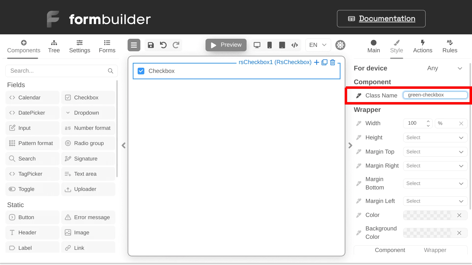
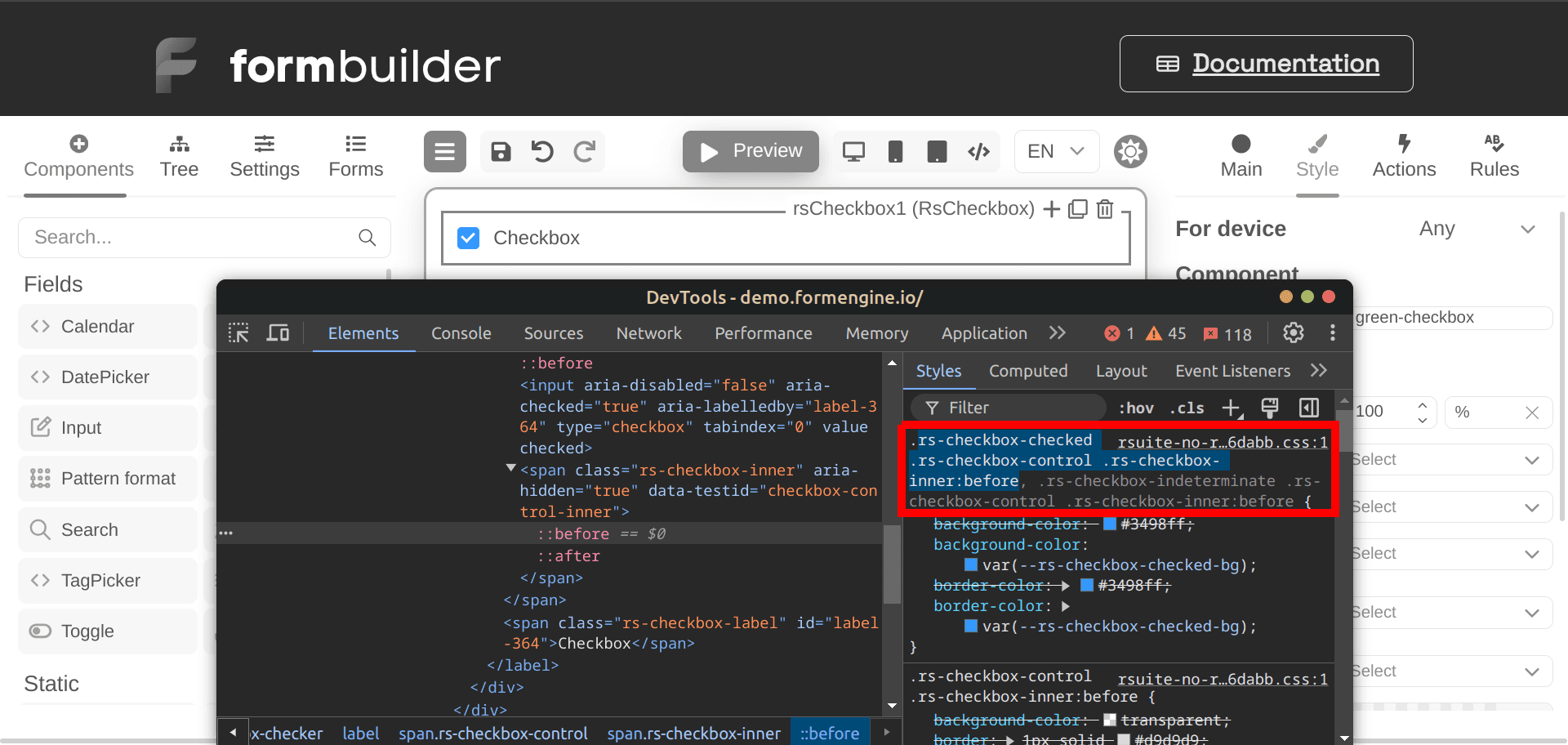
Copy component selectors
Once you have defined the component and its class name, you need to copy the CSS selectors of the component using a code inspection tool like Chrome DevTools. In this example, the checkbox component incorporates the following selectors:::before element.
Provide CSS code to Screen component
After identifying the associated CSS selectors for your component, navigate to the Screen’s Style properties within the user interface. Use the code editor at the bottom of the Style menu to provide the desired styling for your component. Make sure to use the copied selectors to target the component for customization. In this example, the checkbox component will be styled with a green background color and green border color as follows: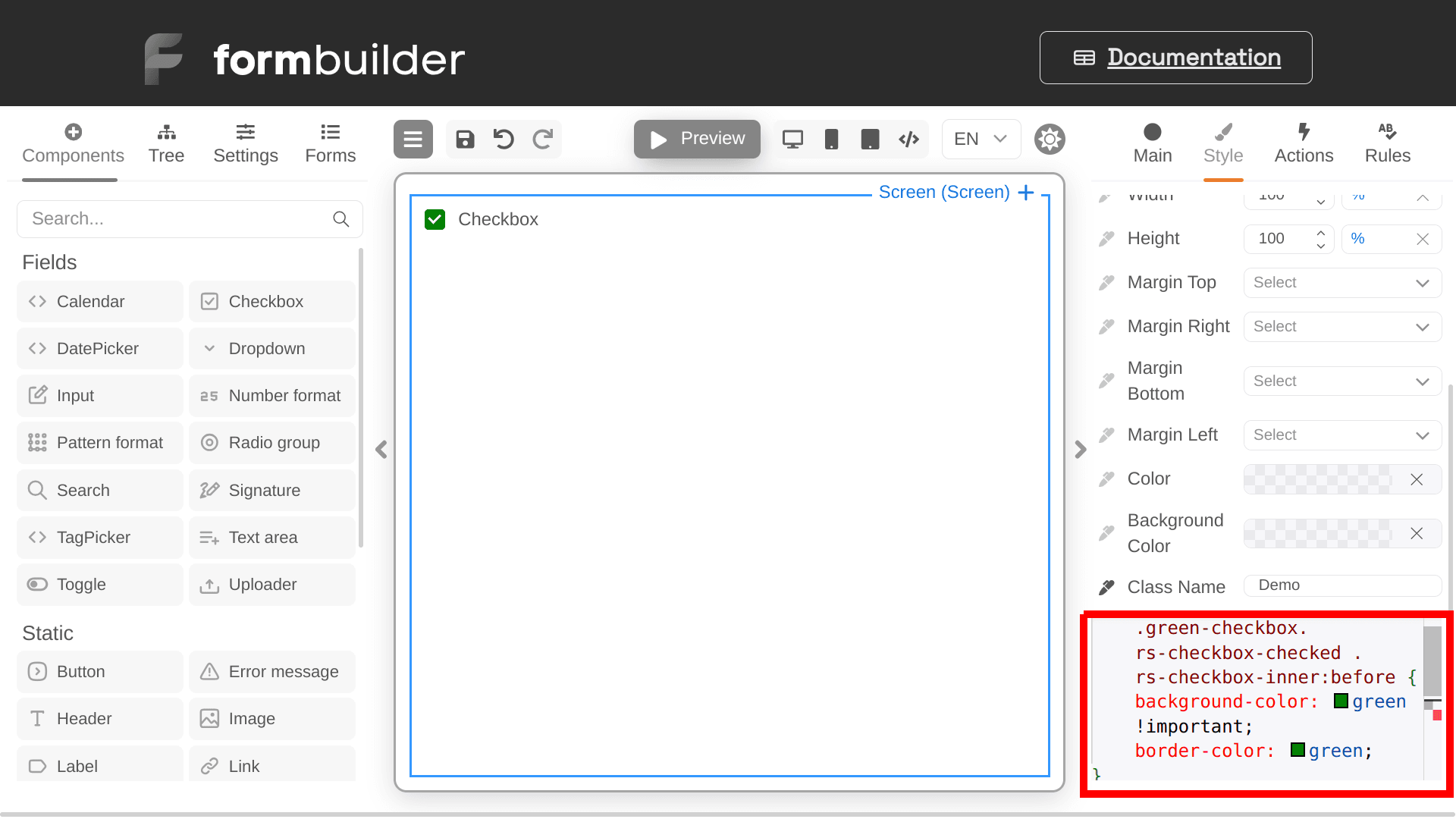
Apply class to new components
Once you have successfully defined the styling for your form’s screen, you can easily apply the same styling to new components by assigning them the defined class name. In this example, two additional checkboxes are created. By assigning them the green-checkbox class, they will automatically change their color to green.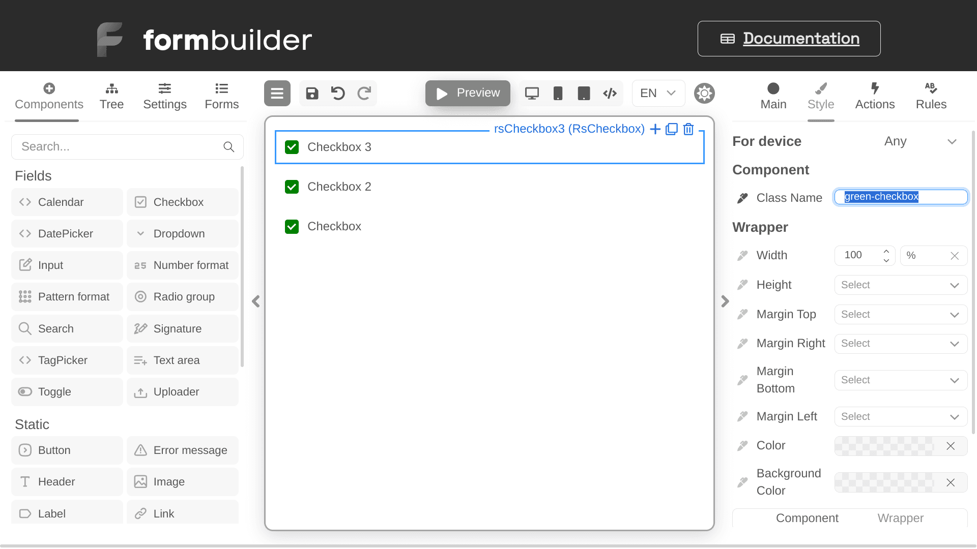
Next steps
- Explore all implementation guides: Guides hub
- Continue with runtime architecture: FormEngine Core
- Add visual form authoring: FormEngine Designer
- Integrate in your stack: Integrations
Official resources
- Runtime package: @react-form-builder/core on npm
- Designer package: @react-form-builder/designer on npm
- Source code and examples: FormEngine GitHub repository
- Commercial Designer plans: Pricing