Each form created in the form designer is JSON. With the designer, you can export a form to JSON, and you can import a form from JSON. Let’s take for example the form from this section of the documentation.

Export form to JSON

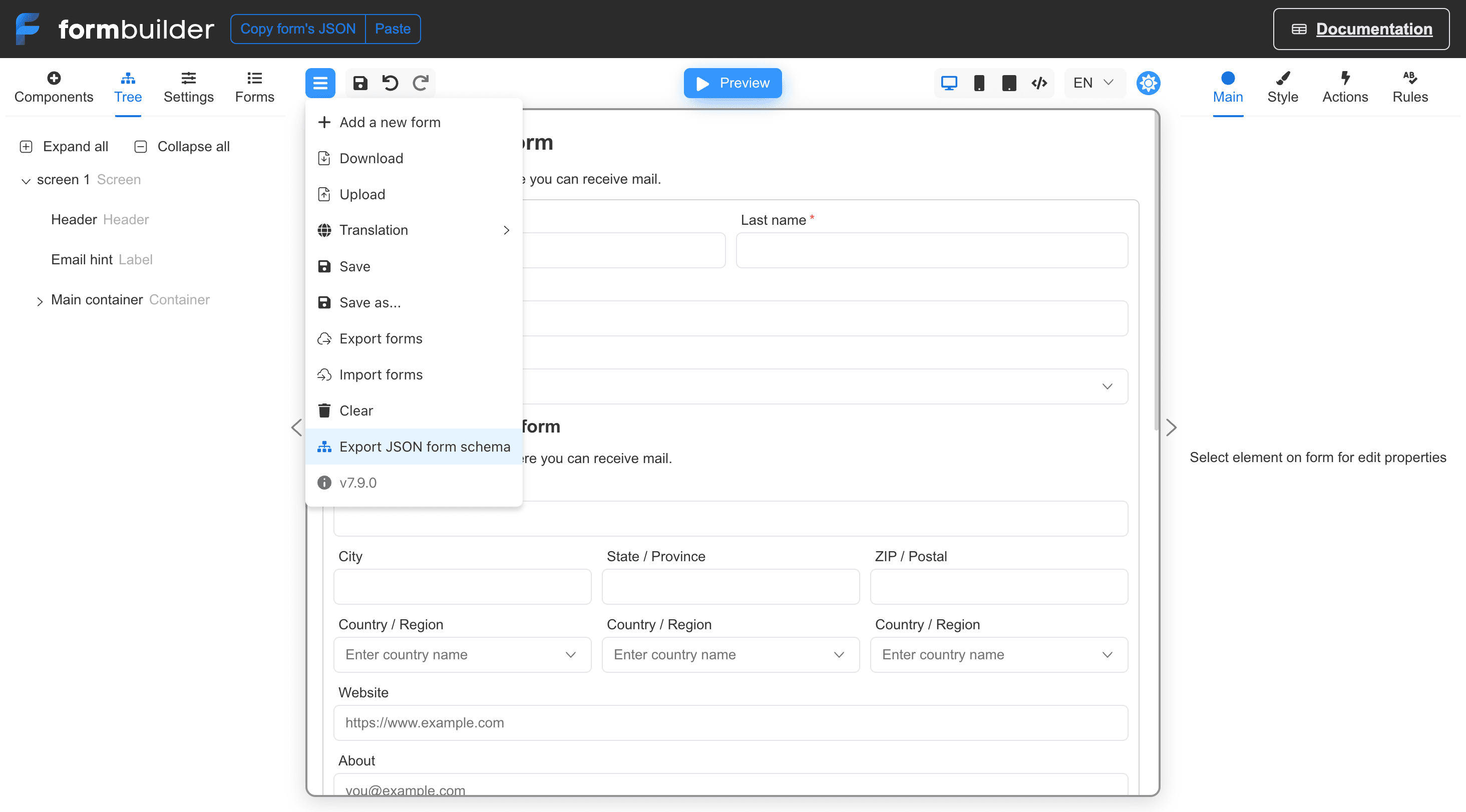
To export a JSON form, go to the designer interface and click the blue menu button and select “Download”. Form's JSON 01 The form will be saved to a file with the extension .json.

Get the form’s JSON in React component

If you need get the form’s JSON inside the React component body, you can use the IFormBuilder ref:
const FormBuilderApp = () => {
  const builderRef = useRef<IFormBuilder>()

  const setRef = (builder: IFormBuilder | null) => {
    if (builder) {
      builderRef.current = builder
      const formJSON = builder.formAsString
      console.log(formJSON)
    }
  }

  return <FormBuilder
    builderRef={setRef}
    {...otherProps}
  />
}

Import form from JSON

To import a form in JSON format, select the blue menu button in the designer, and then select “Upload”. Form's JSON 02

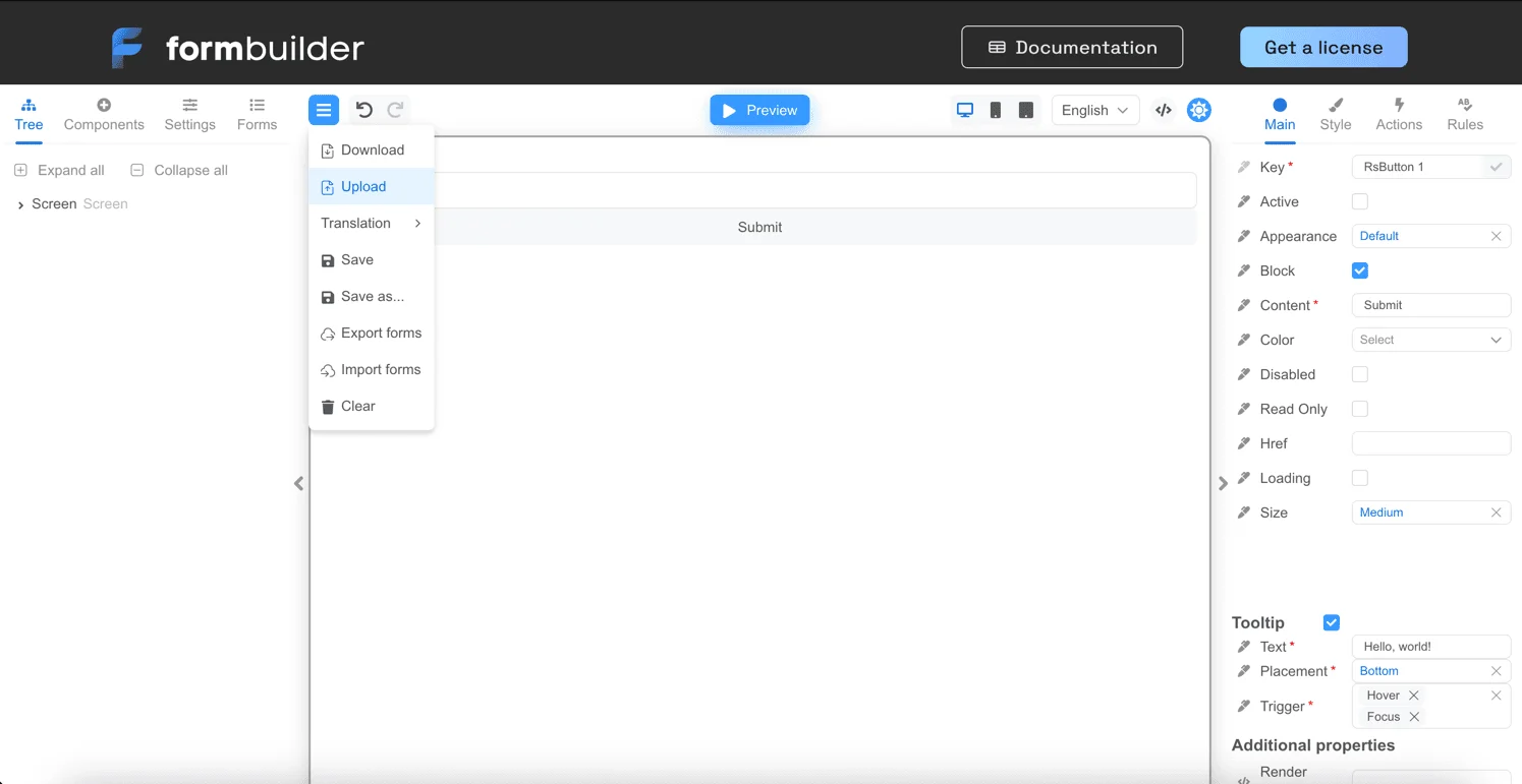
Embedded JSON form editor

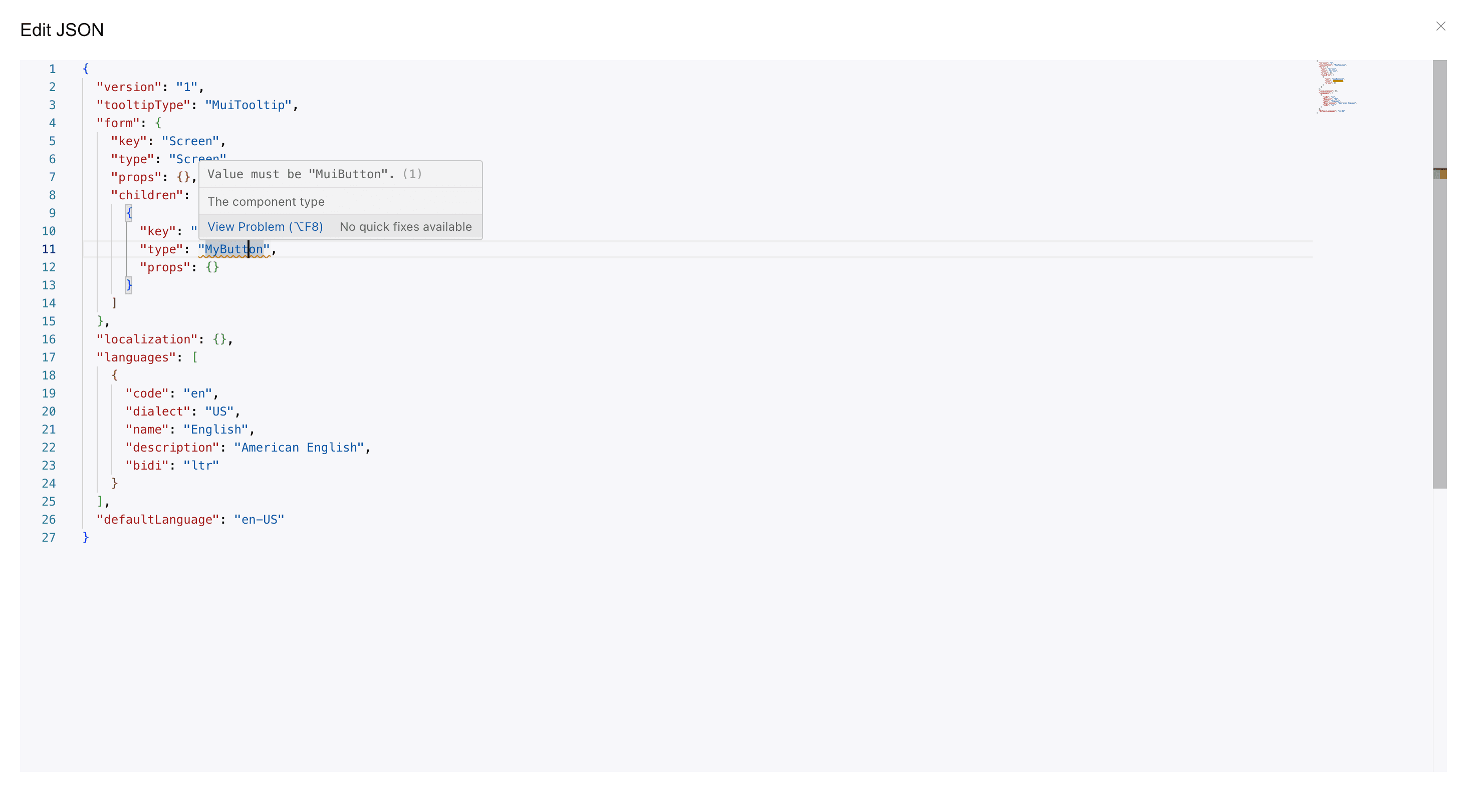
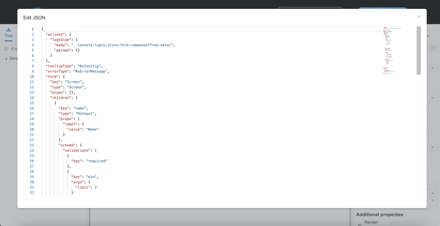
You can also edit the form data in JSON directly in the form designer. To do this, you need to click the “Edit JSON” button, as in the screenshot below. img.png This opens the built-in JSON form code editor. After you close the form by clicking the close button in the top right corner of the screen, the JSON with the form code will be applied in the form designer. img_1.png

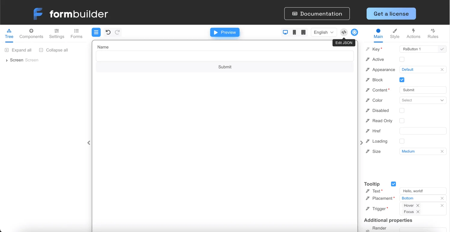
JSON form description

Let’s take a look at what a JSON form is, below is an example:
{
  "version": "1",
  "actions": {
    "logValue": {
      "body": "  console.log('Name', e.data.name)",
      "params": {}
    }
  },
  "tooltipType": "RsTooltip",
  "errorType": "RsErrorMessage",
  "form": {
    "key": "Screen",
    "type": "Screen",
    "props": {},
    "children": [
      {
        "key": "name",
        "type": "RsInput",
        "props": {
          "label": {
            "value": "Name"
          }
        },
        "schema": {
          "validations": [
            {
              "key": "required"
            },
            {
              "key": "min",
              "args": {
                "limit": 3
              }
            }
          ]
        }
      },
      {
        "key": "RsButton 1",
        "type": "RsButton",
        "props": {
          "children": {
            "value": "Submit"
          }
        },
        "events": {
          "onClick": [
            {
              "name": "validate",
              "type": "common"
            },
            {
              "name": "logValue",
              "type": "code"
            }
          ]
        },
        "tooltipProps": {
          "text": {
            "value": "Hello, world!"
          },
          "trigger": {
            "value": [
              "hover",
              "focus"
            ]
          }
        }
      }
    ]
  },
  "localization": {},
  "languages": [
    {
      "code": "en",
      "dialect": "US",
      "name": "English",
      "description": "American English",
      "bidi": "ltr"
    }
  ],
  "defaultLanguage": "en-US"
}
The form is represented by the PersistedForm type. Let’s take a closer look at the parts of this JSON.

Version

This is the version of the form saved in JSON format. The list of possible versions is listed in PersistedFormVersion.
{
  "version": "1",
  ...
}

Actions

A list of actions is simply a Record, the key in that Record is the name of the action, the value is the function body and function parameters.
{
  "actions": {
    "logValue": {
      "body": "  console.log('Name', e.data.name)",
      "params": {}
    }
  },
  ...
}

Types of error, modal and tooltip components

  • tooltipType - the name of the component type (usually the displayName of the React component) that displays the tooltip.
  • errorType - the name of the component type (usually the displayName of the React component) that displays the error.
  • modalType - the name of the component type (usually the displayName of the React component) that displays the modal window.
{
  ...
  "tooltipType": "RsTooltip",
  "errorType": "RsErrorMessage",
  "modalType": "RsModal",
  ...
}

Form

This describes the form itself, which is represented by a component tree, see the ComponentStore type for more details. form is the root element of the component tree.
{
  ...,
  "form": {
    "key": "Screen",
    "type": "Screen",
    "props": {},
    "children": [
      {
        "key": "name",
        "type": "RsInput",
        "props": {
          "label": {
            "value": "Name"
          }
        },
        "schema": {
          "validations": [
            {
              "key": "required"
            },
            {
              "key": "min",
              "args": {
                "limit": 3
              }
            }
          ]
        }
      },
      {
        "key": "RsButton 1",
        "type": "RsButton",
        "props": {
          "children": {
            "value": "Submit"
          }
        },
        "events": {
          "onClick": [
            {
              "name": "validate",
              "type": "common"
            },
            {
              "name": "logValue",
              "type": "code"
            }
          ]
        },
        "tooltipProps": {
          "text": {
            "value": "Hello, world!"
          },
          "trigger": {
            "value": [
              "hover",
              "focus"
            ]
          }
        }
      }
    ]
  },
  ...
}

Localization

The next set of data relates to localization.
  • localization - a form localization data ( see LocalizationValue). The Fluent language is used for localization.
  • languages - an array of languages that the form supports. The language is described by the Language type.
  • defaultLanguage - the default form language, e.g. ‘en-US’.
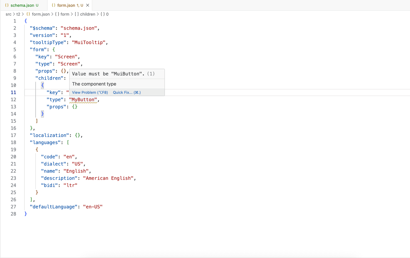
{
  ...
  "localization": {},
  "languages": [
    {
      "code": "en",
      "dialect": "US",
      "name": "English",
      "description": "American English",
      "bidi": "ltr"
    }
  ],
  "defaultLanguage": "en-US"
}

JSON schema

You have the option to generate a JSON schema for your set of components used in the form. After generating the schema, you can connect it to your code editor and validate the JSON form using the IDE. Generation is performed using the createSchema function from the @react-form-builder/json-schema-generator package.

function generateJsonFormSchema() {
  // or use your components
  const myComponents = components
  // or use your component descriptions
  const myDescriptions = rSuiteComponentsDescriptions
  const schema = createSchema(myComponents, [myDescriptions])
  return JSON.stringify(schema, undefined, 2)
}
Form's JSON 07 You can also enable JSON schema generation from the Designer:

const generateJsonFormSchema = (options: GenerateJsonFormSchemaOptions) => {
  const {components, descriptions} = options
  const schema = createSchema(components, descriptions)
  return JSON.stringify(schema, undefined, 2)
}

export const App = () => {
  return <FormBuilder
    view={builderViewWithCss}
    generateJsonFormSchema={generateJsonFormSchema}
  />
}
After that, the menu item for downloading JSON schema will be available. Form's JSON 05 The built-in JSON form editor will also use a JSON schema: Form's JSON 06
Last modified on April 16, 2026