- Any - these styles are applied to all devices, regardless of window width.
- Desktop - for desktop devices with a window width greater than 900 pixels.
- Mobile - for mobile devices where the window width is less than or equal to 600 pixels.
- Tablet - for tablet devices where the window width is less than or equal to 900 pixels.
- Custom breakpoints - this functionality is in development. Will be added later.
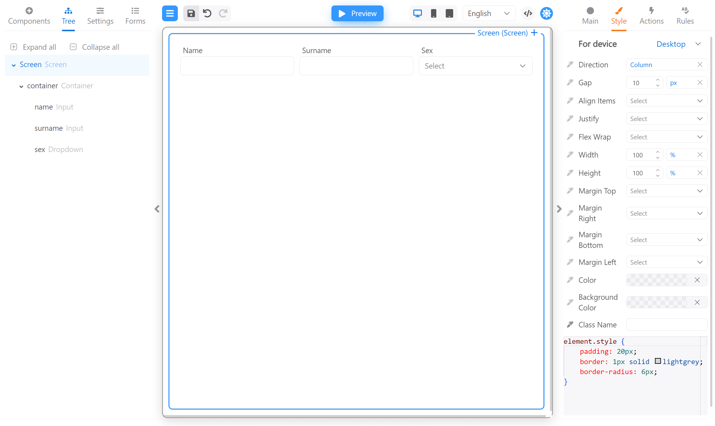
Screen in Desktop mode:
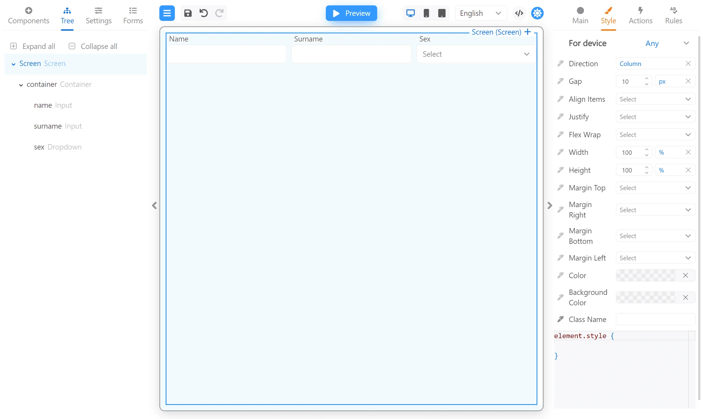
Direction: row and Flex wrap: wrap for the container in Mobile mode:
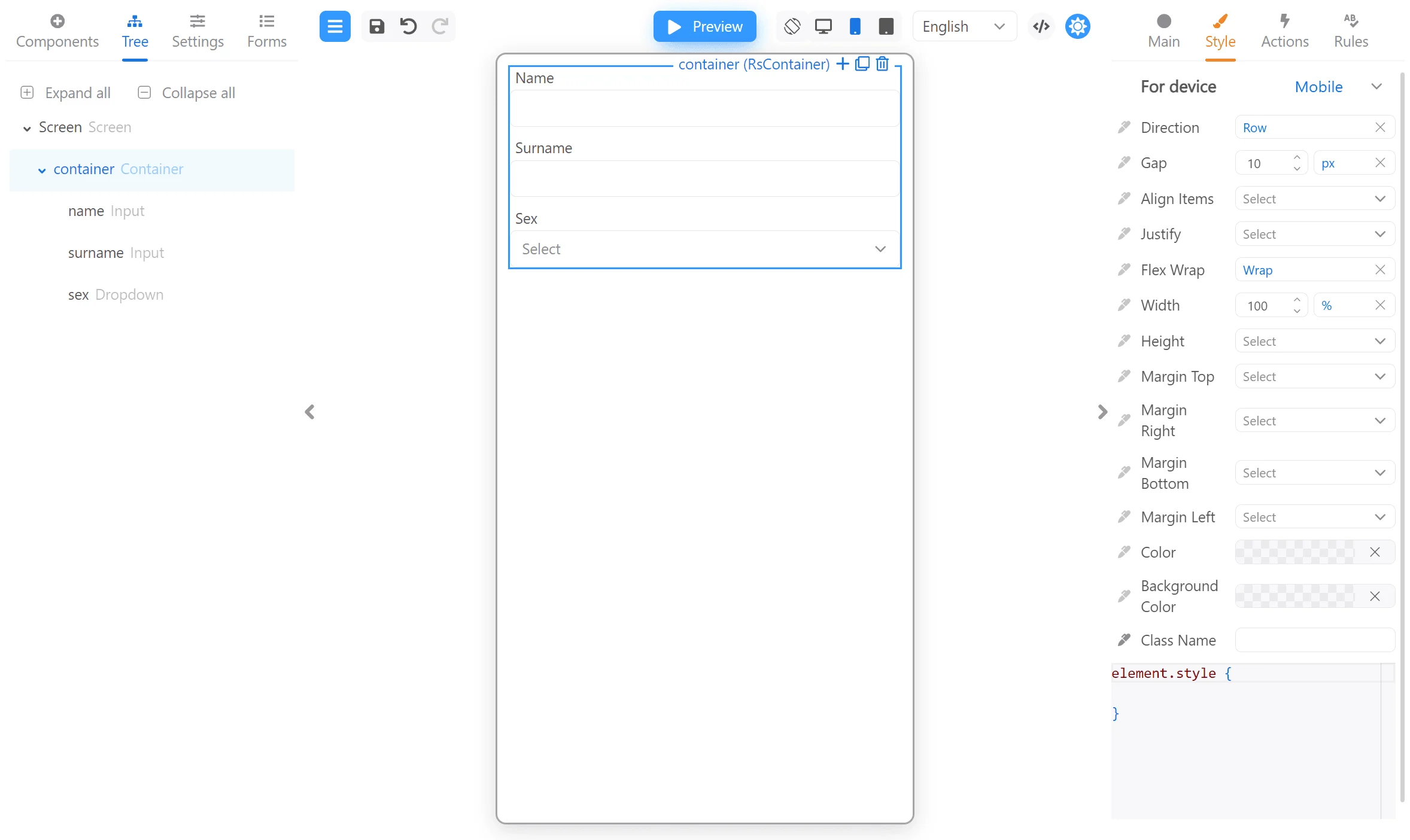
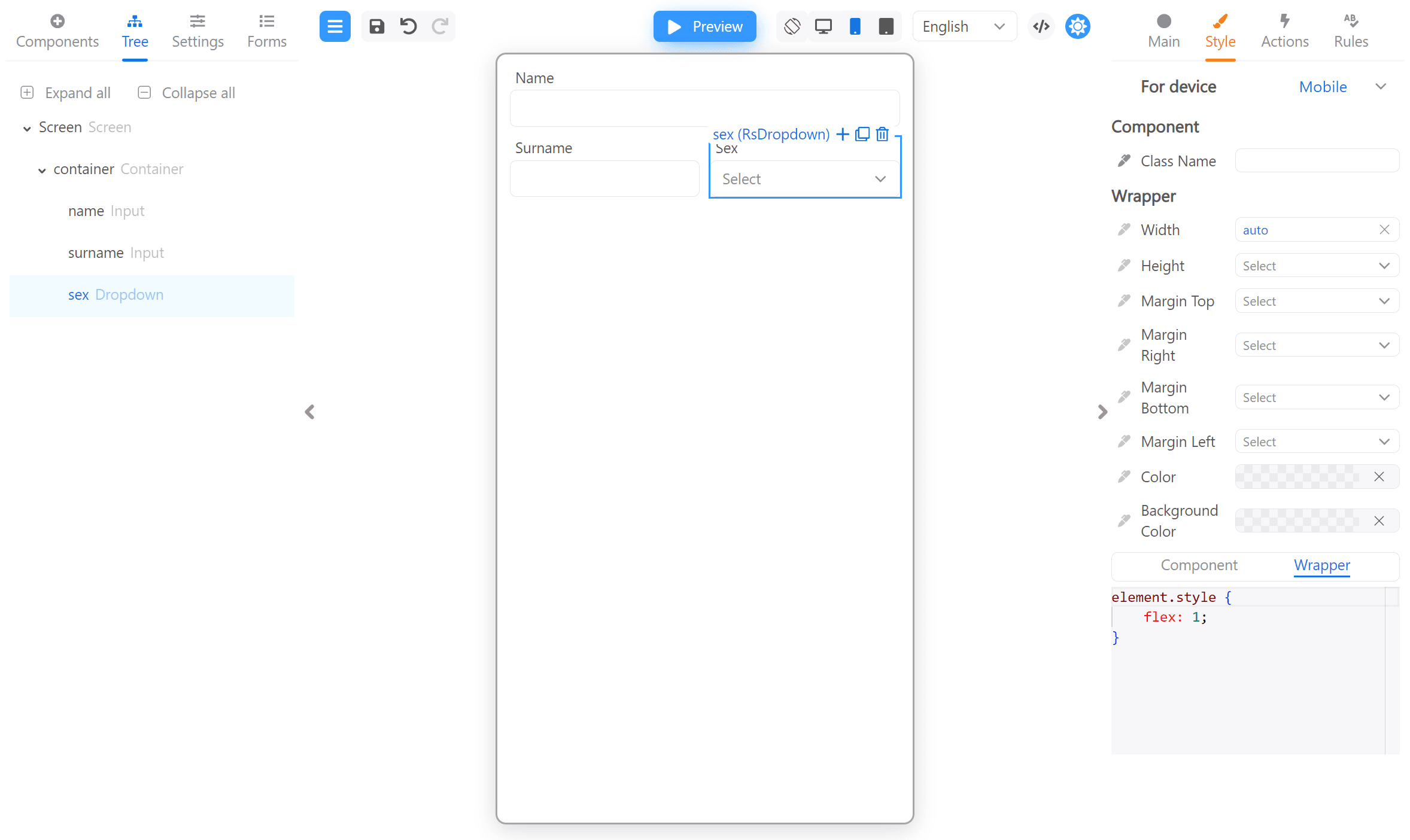
Width: auto and flex: 1 for Surname and Sex inputs Wrapper: