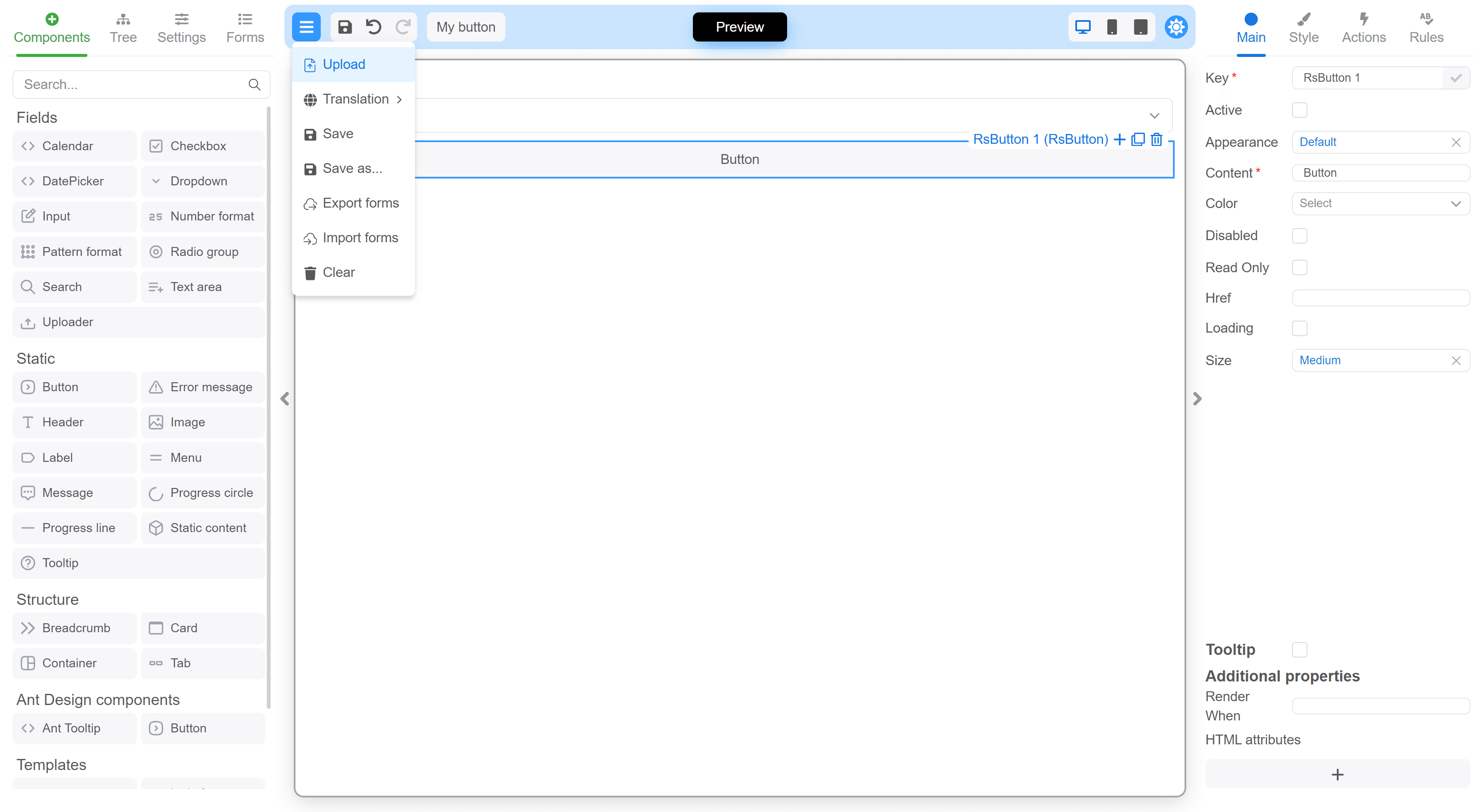
Customizing the FormBuilder interface
Using the customizationFormBuilder prop, you can
hide, style, or replace any parts of the FormBuilder interface.
A customization map object is passed to this property, in which
the options of the desired component are set using
its customizable key.
You can manage the FormBuilder and get its state in custom components
using useFormBuilder. It provides access
to IFormBuilder. The management options are limited at the moment,
but they will be expanded in the future.
Another option for customizing the component is to use pure CSS. Each component has a static CSS class named with the component’s name
prefixed by FE_. This class is applied to the same element as the style or className attributes, utilizing
the customization map.
The components palette in the left panel also has some additional rules for CSS customization.
A list of customizable components is also available as a Set.
Example
Complete list of customizable component keys
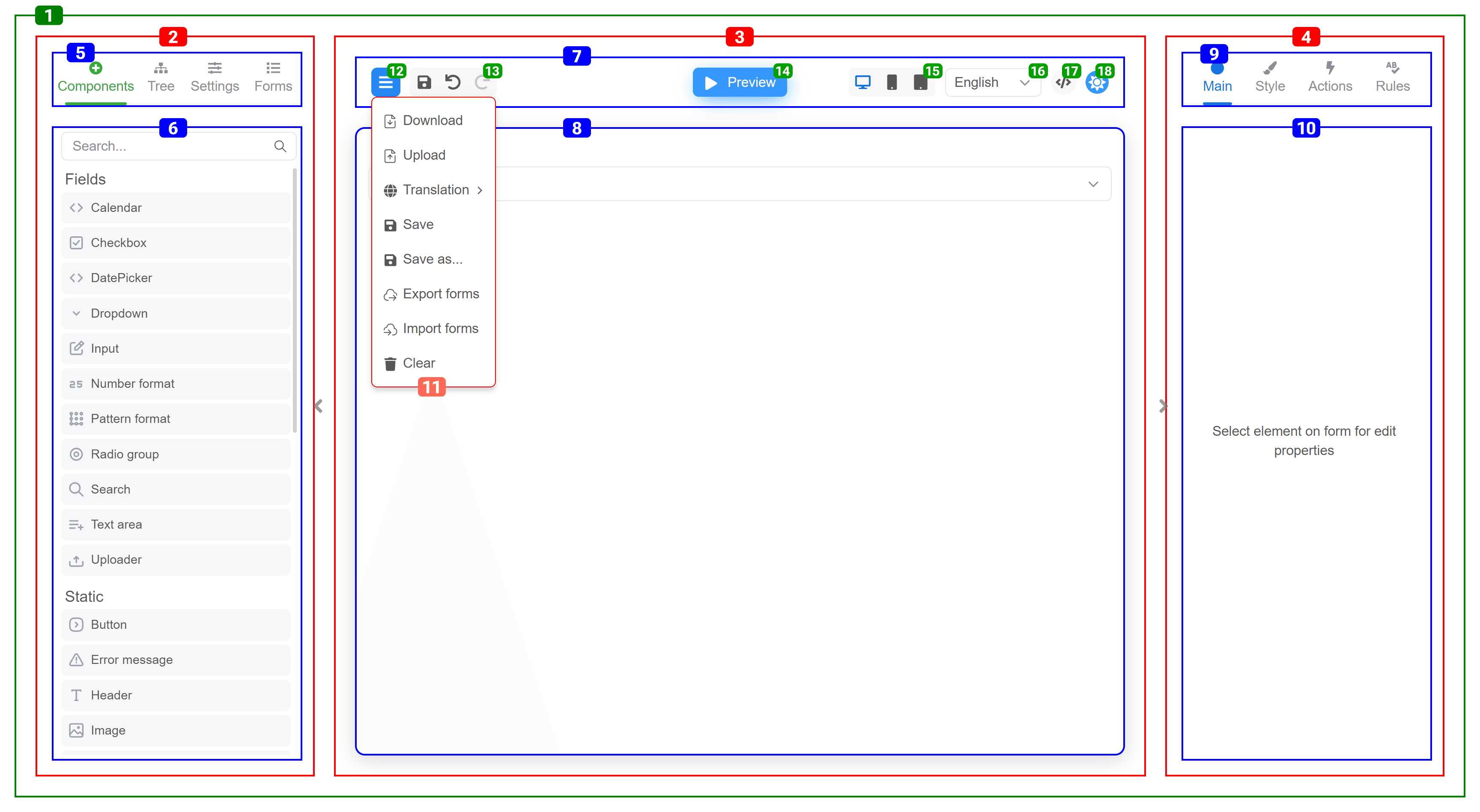
| # | Name | className |
|---|---|---|
| 1 | MainContainer | FE_MainContainer |
| 2 | LeftPanel | FE_LeftPanel |
| 3 | CentralPanel | FE_CentralPanel |
| 4 | RightPanel | FE_RightPanel |
| 5 | LeftPanel_Nav | FE_LeftPanel_Nav |
| 6 | LeftPanel_Content | FE_LeftPanel_Content |
| 7 | Header | FE_Header |
| 8 | FormContainer | FE_FormContainer |
| 9 | RightPanel_Nav | FE_RightPanel_Nav |
| 10 | RightPanel_Content | FE_RightPanel_Content |
| 11 | MainMenu_Dropdown | FE_MainMenu_Dropdown |
| 12 | MainMenu_Button | FE_MainMenu_Button |
| 13 | Header_Toolbar | FE_Header_Toolbar |
| 14 | Component_Toolbar | FE_Component_Toolbar |
| 15 | Component_Toolbar_Items | FE_Component_Toolbar_Items |
| 16 | Component_Toolbar_Title | FE_Component_Toolbar_Title |
| 17 | Component_Toolbar_AddButton | FE_Component_Toolbar_AddButton |
| 18 | Component_Toolbar_CloneButton | FE_Component_Toolbar_CloneButton |
| 19 | Component_Toolbar_PresetComponentButton | FE_Component_Toolbar_PresetComponentButton |
| 20 | Component_Toolbar_RemoveButton | FE_Component_Toolbar_RemoveButton |
| 21 | ToggleModeButton | FE_ToggleModeButton |
| 22 | ResolutionSelect | FE_ResolutionSelect |
| 23 | LocalizationSelect | FE_LocalizationSelect |
| 24 | JsonViewButton | FE_JsonViewButton |
| 25 | ToggleThemeButton | FE_ToggleThemeButton |
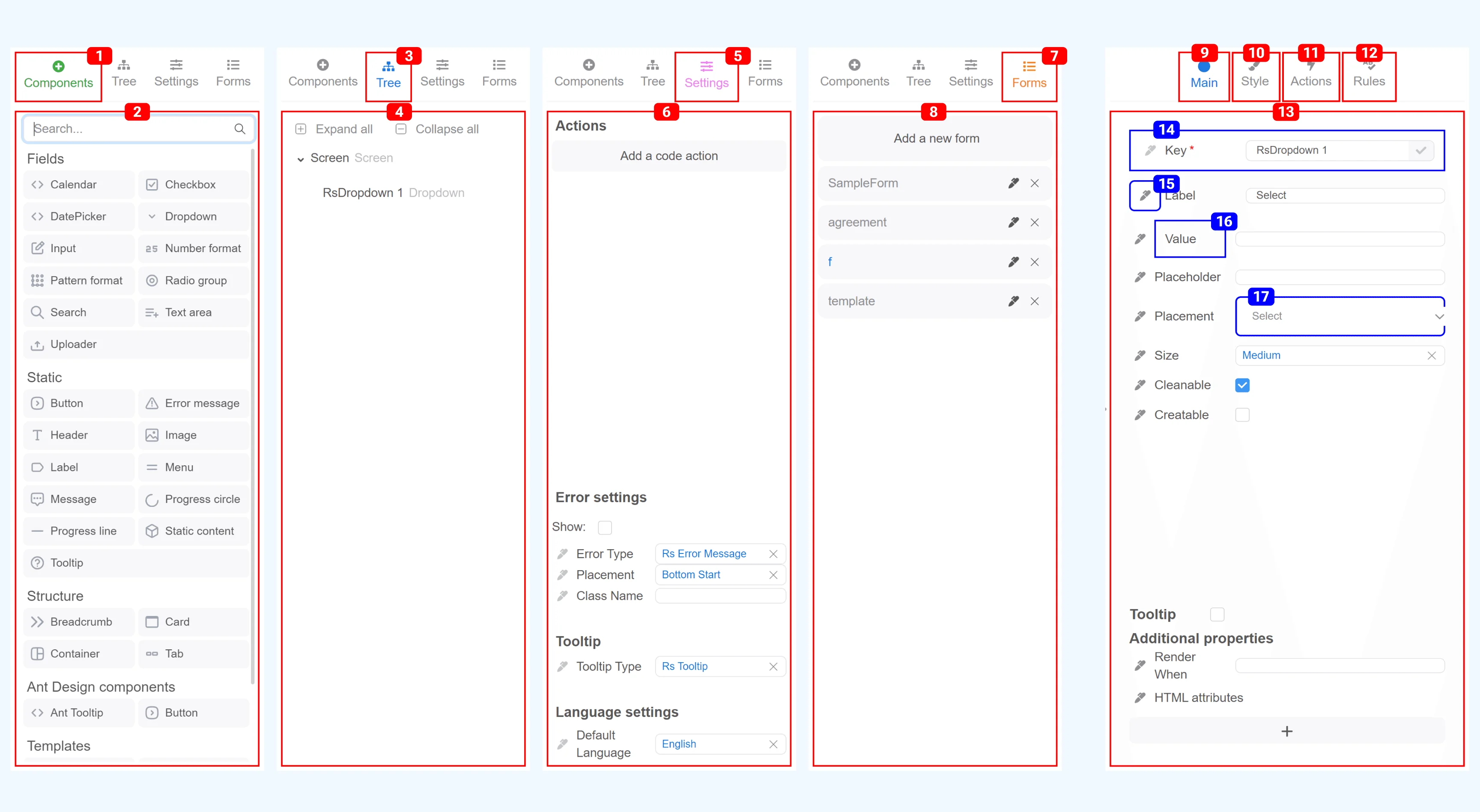
Style_Tab_Content,
Actions_Tab_Content,
Rules_Tab_Content | FE_Main_Tab_Content,
FE_Style_Tab_Content,
FE_Actions_Tab_Content,
FE_Rules_Tab_Content | | | 14 | LabeledProperty | FE_LabeledProperty | valueModified | | 15 | PropertyCodeButton | FE_PropertyCodeButton | | | 16 | PropertyLabel | FE_PropertyLabel | | | 17 | PropertyInput | FE_PropertyInput | |
Next steps
- Component Styling — Customize form component appearance
- Designer Presets — Create reusable component groups
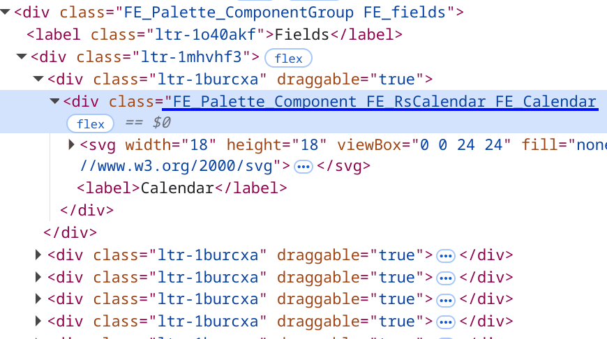
Components palette
Each group and component receives a set of classes composed of its name and type. When defining a component, you can specify its category. Components with the same category are merged into component groups on the palette.Components group
A component group is assigned the static classFE_Palette_ComponentGroup along with a category name prefixed with FE_.
If a component group is not defined, components appear at the top of the list without a title and within container with additional class
FE_top.
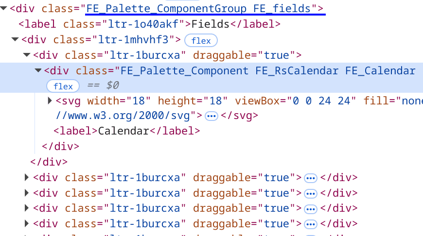
Single component
A component receives the static classFE_Palette_Component composed with its title and name, both prefixed with FE_.